Lakes & Grapes
The Challenge
Lakes and Grapes needed a logo that could capture two distinct identities at once — a working vineyard and a wine tasting experience set against the water. The name itself was the brief: it needed to feel like both halves belonged together, not like two separate ideas bolted on. The mark had to work as a bottle label, a sign at the vineyard gate, and a small icon on social media, all while feeling premium enough for a tasting-room brand.
The Solution
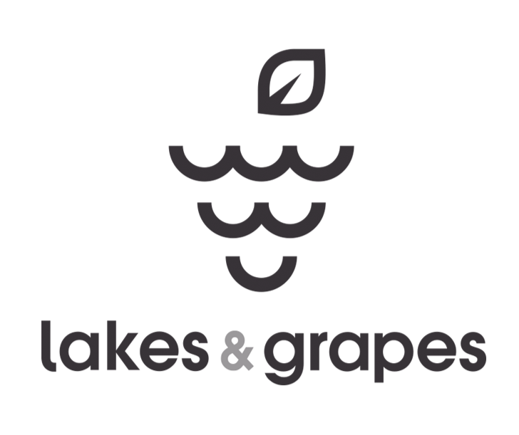
The idea came from looking for a shape that could do double duty. Ripples on water and a bunch of grapes share a surprising amount in common — soft, rounded, overlapping forms — so the concept became clear: build a cluster of grapes entirely out of ripple shapes, with a single leaf placed over the top to complete the illusion. From a distance, it reads instantly as a bunch of grapes. Look closer, and the water is unmistakably there, tying the mark back to the lake the vineyard sits beside.
The Result
The final logo gives Lakes and Grapes a mark that's genuinely their own — one visual idea that speaks to both the setting and the product, rather than a generic grape icon or a generic wave. It works as cleanly on a wine label as it does on a t-shirt or a sign by the water, and it tells the story of the business before a single word is read.