Grunt works
Grunt Works Branding Project
Challenge
The client was launching GruntWorks Junk Removal and Demolition — a veteran-owned company entering a crowded market of national franchises and local competitors alike. He needed a full brand identity that could stand out on everything from business cards to yard signs, while staying true to a specific set of priorities: simple, uncluttered, and built to last, with a slight vintage edge that still felt tough enough to match a name like "GruntWorks."
The brand also had to speak to a broad, practical customer base — realtors, homeowners, property managers, remodellers, and senior living communities across southeastern Wisconsin, without leaning on the tired visual clichés of the junk removal industry. Stock cartoon characters and bubbly, casual fonts were explicitly off the table. Ken wanted something that reflected the values behind the business: integrity, discipline, family, and service, along with a mascot inspired by the "Teufel Hunden" bulldog — a nod to grit and toughness, without directly referencing any specific military branch.
Solution
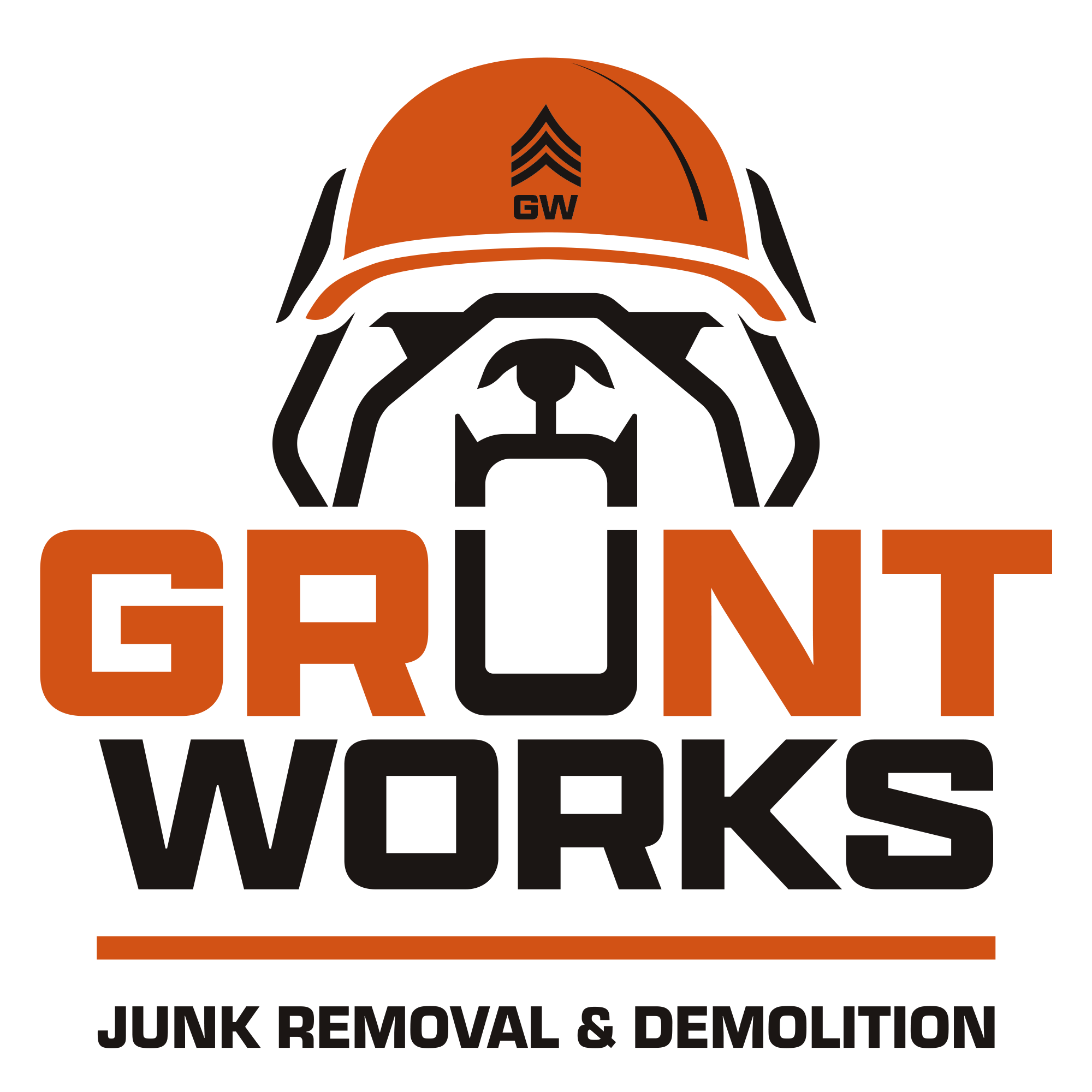
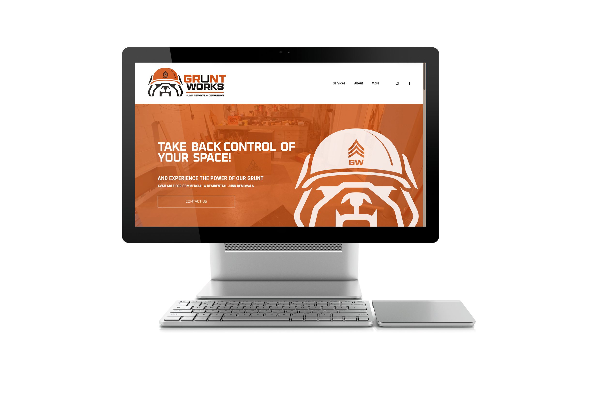
The mark centers on a bulldog — stern, square-jawed, unmistakably tough — wearing a hard hat instead of a helmet. It's a small swap that does a lot of work: the military bearing the client wanted is there in the bulldog's expression and the sergeant's chevrons stitched into the hat, but the hard hat keeps the connection squarely in construction and labor, sidestepping any direct tie to a specific branch of service.
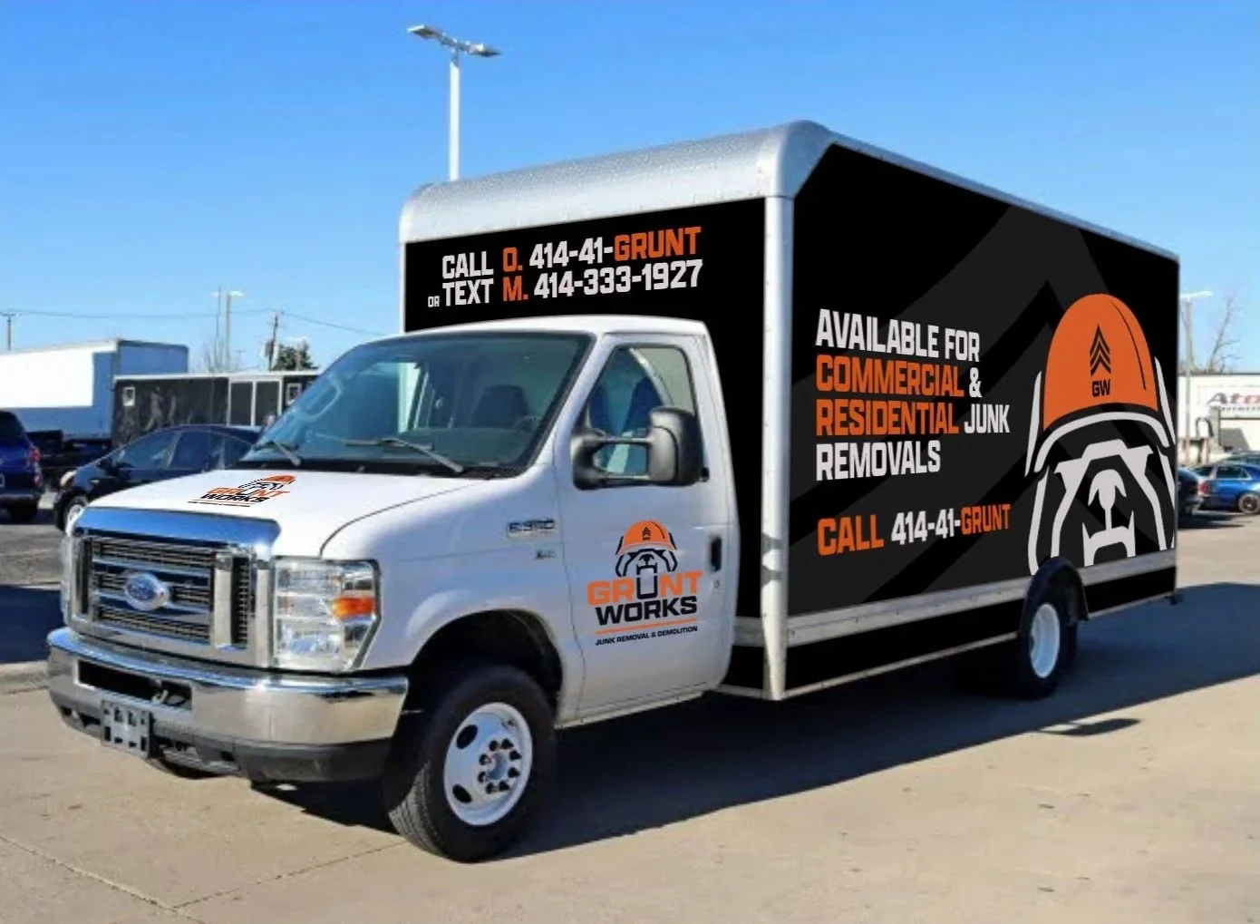
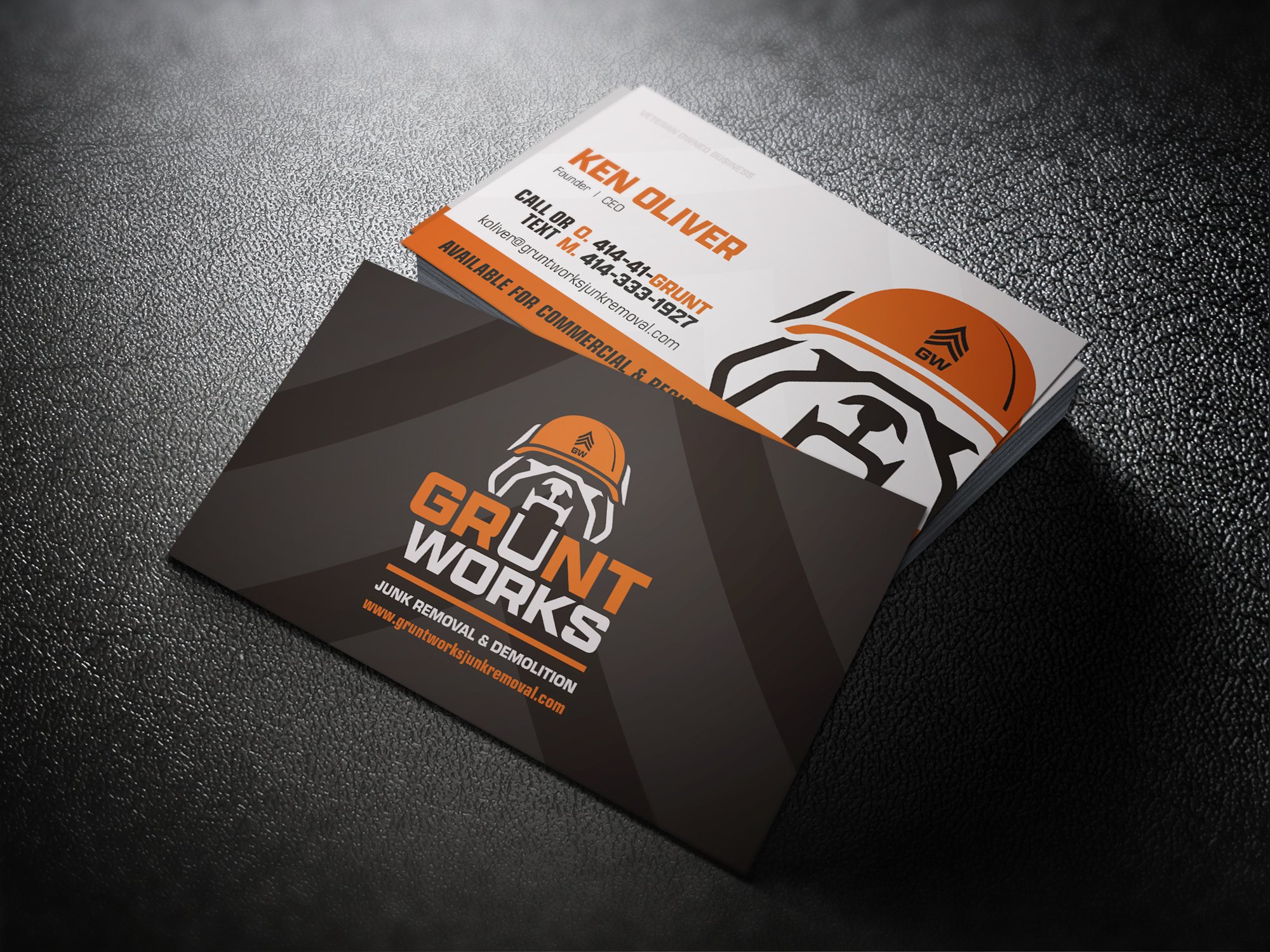
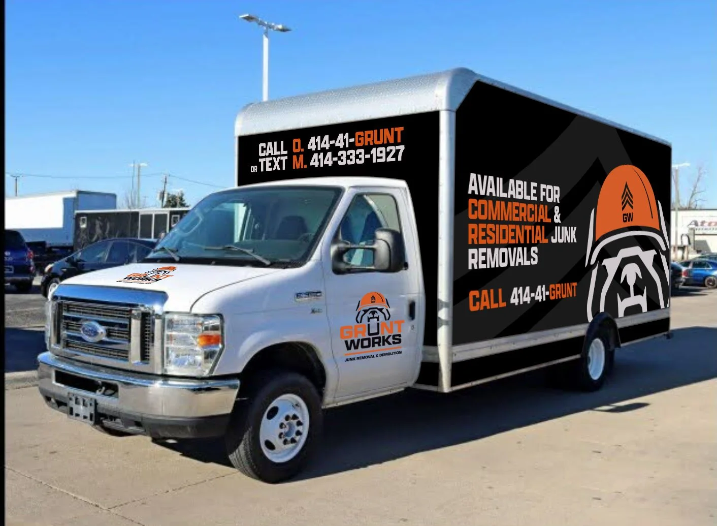
Those chevrons don't stay confined to the logo. They carry through as a background graphic across every application — business cards, signage, vehicles — giving the whole brand a consistent, unmistakably military texture without needing to repeat the mascot everywhere. The wordmark itself stays bold and blocky, with "GRUNT" in the brand's signature orange and "WORKS" in solid black, keeping the name easy to read at a glance whether it's on a yard sign from the street or a business card in someone's hand.
The color palette pulls from rust, sienna, and burnt orange tones — warm and grounded, with a worn-in quality that gives the brand the vintage feel Ken was after, while the bold black outlines and hard geometric shapes keep it from ever feeling soft or dated.
The Result
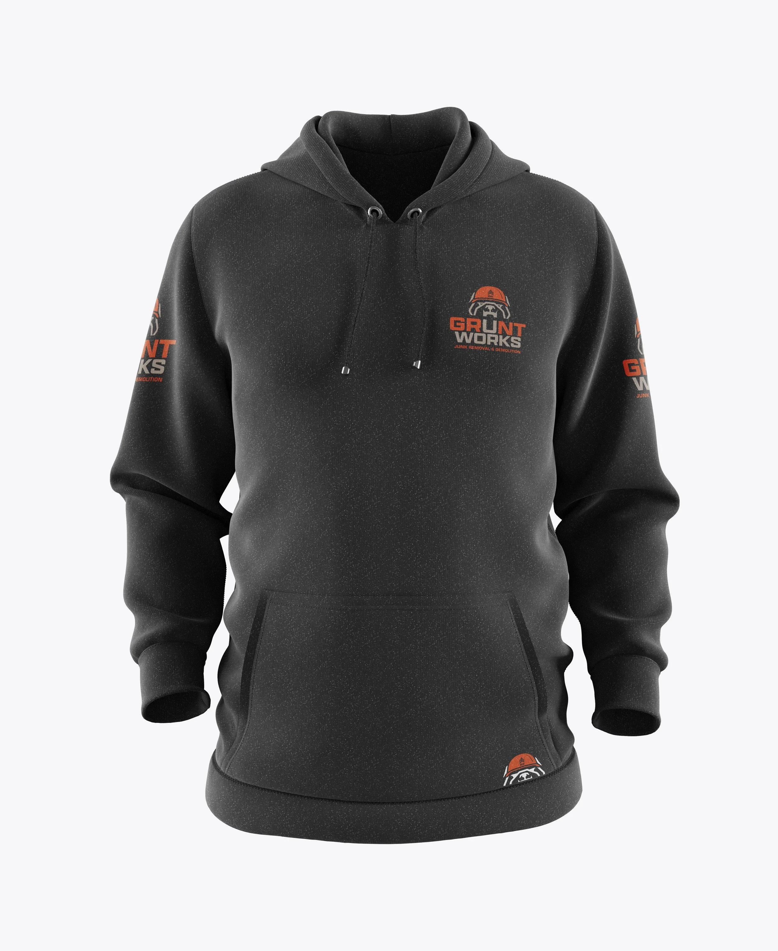
GruntWorks now has a brand identity that's immediately recognizable and true to who Ken is — a veteran-owned company built on discipline, service, and family. The bulldog mascot gives the business a face and a personality without relying on stock imagery, and the chevron pattern ties every piece of collateral back to the same visual language, whether it's a door hanger, a trifold, or the side of a truck.
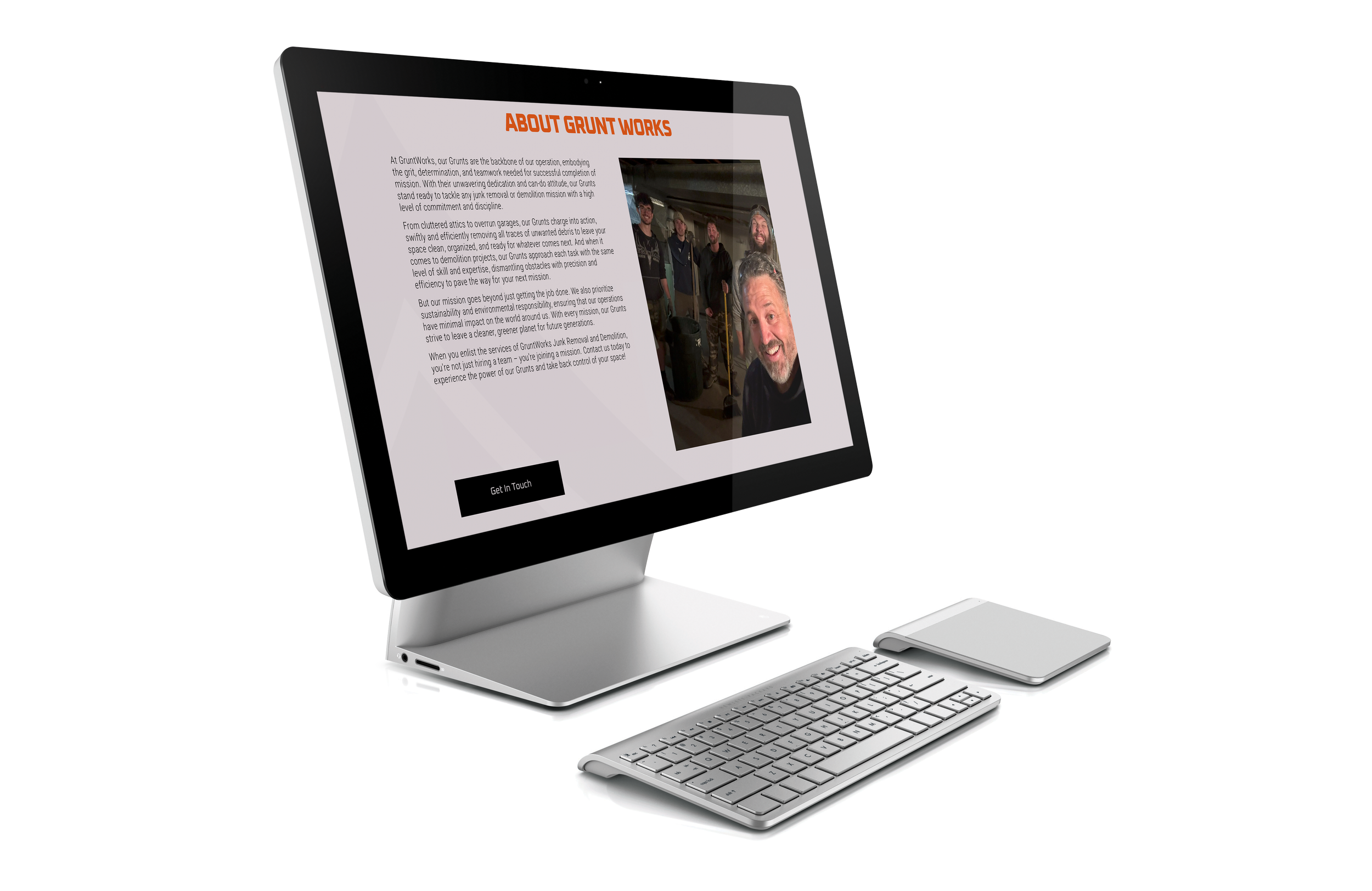
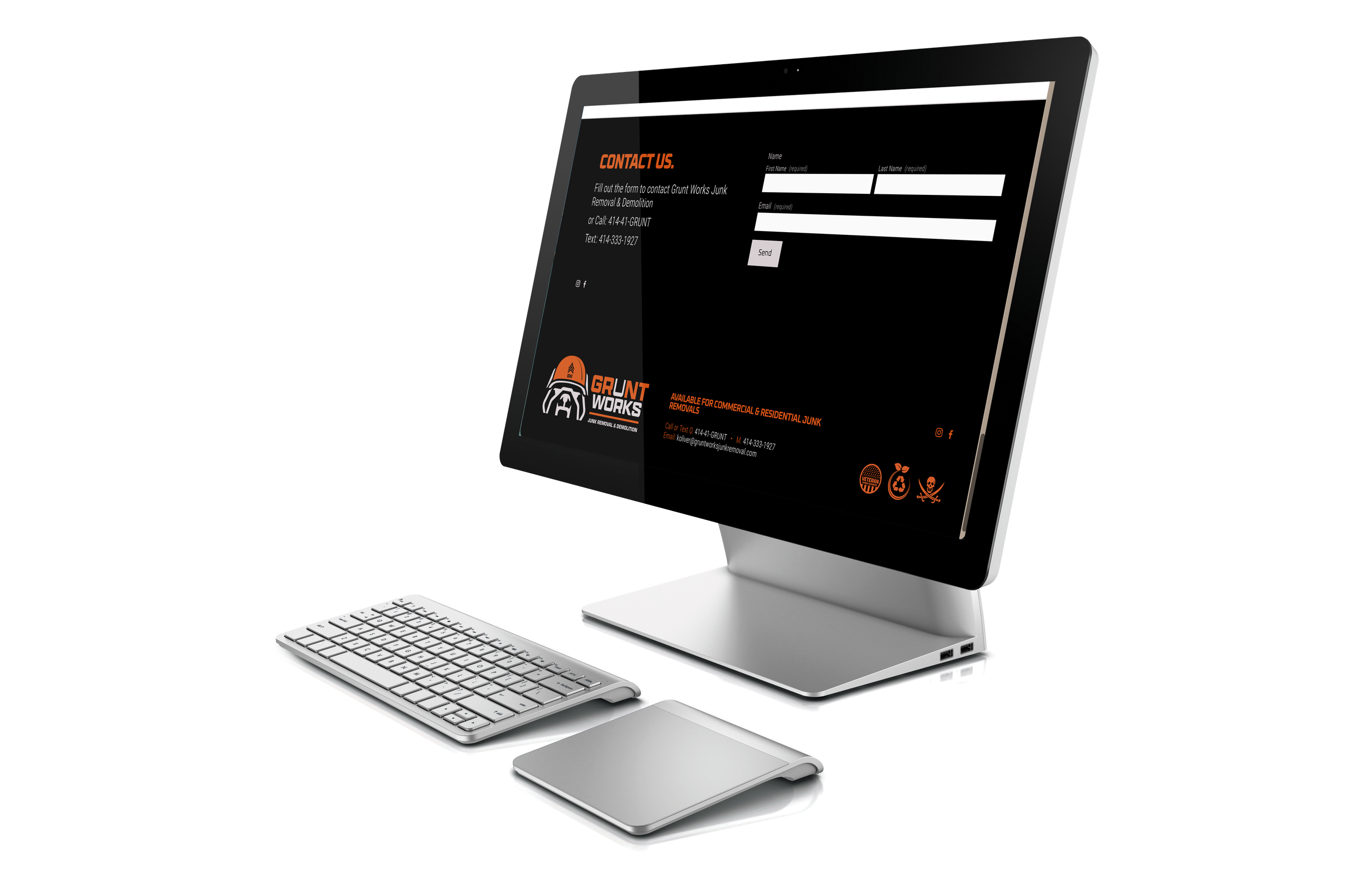
You can see Gruntworks website here. https://www.gruntworksjunkremoval.com